How to choose a colour scale for data visualization
April 06, 2021
We've been working with geospatial data and wanted to represent data on maps with colour so we set out to better understand how different colour schemes are used in data visualization so that we could create our own. We found this topic to be unexpectedly complex as there are many factors that need to be considered when creating a good colour scheme. In this blog post we will explore how to effectively use colour to best describe what is going on in your data by looking at some of the best practices for deciding upon a colour scheme that is appropriate for the data at hand.
There are many different methods of representing colour as numbers, of which RGB (red, green, blue) seems to be the most popular. While this may be the case, HSL (hue, saturation, lightness) is far better for data visualization purposes as it was built to be more human-friendly and tries to mimic the way humans perceive real-world colours. As we will soon come to realize, understanding the way we perceive colour plays a significant role in how we create meaningful colour schemes.
Understanding HSL
HSL stands for Hue, Saturation & Lightness.
Working with colours represented as varying extents of Hue, Saturation, and Lightness is far more intuitive than working with RGB. With a simple understanding of HSL, you should be able to mentally visualize what a colour represented with HSL looks like without having to look at a colour wheel or by looking the colour up.
Hover your mouse over the colours to see its HSL value:
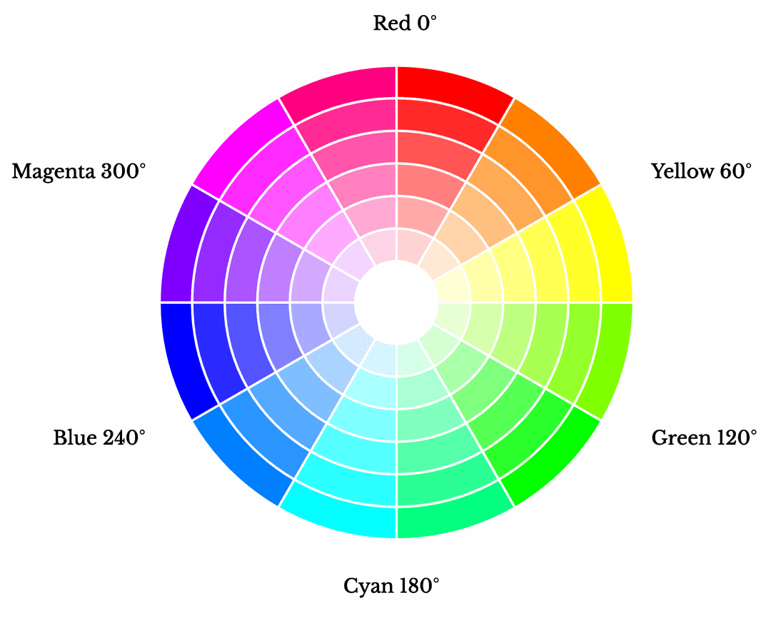
Hue refers to the base colour. The HSL colour wheel is made up of colours in their purest form as only primary colours are used to create colours in the wheel. No black, white, and grey were used in the mixing process to create these colours. Colours on the HSL colour wheel are represented in degrees, it goes from red at 0 degrees to yellow, to lime, to aqua, to blue, to magenta, and finally back to red. For this reason, 0° on the hue colour wheel is red and then 360° is red again.
Saturation is the intensity of the hue. A fully saturated hue is one that has not been mixed with either black, white or grey and is therefore at its highest level of intensity in its purest form as shown on the colour wheel. If the colour is entirely unsaturated, then the colour will appear like a shade of grey.
Lightness represents the brightness of the chosen colour. Again, like saturation, this is also a percentage scale. 0% lightness is complete darkness, meaning full black. 100% lightness is blinding light, which is pure white.
This essentially means that to represent a colour in its purest form, pick its hue value, keep saturation at 100% and lightness at 50%.
The three types of colour schemes
Now that we understand the HSL method of representing colour, we can look into the different types of colour schemes and how to choose the correct colour scheme depending on the data that you are trying to visualize.
Colour can be a very effective when trying to visualize data. It is frequently used in all sorts of data visualizations and can be used to show relationships and trends but also areas of contrast. It is an engaging medium that if used correctly can portray a great deal of information about your data both quickly and intuitively.
There are lots of different weather and geographic quantities that can be helpful display on a map using colour, like precipitation and political party popularity, each of which requires a different type of colour scheme. There are three main types of colour schemes: sequential, diverging, and qualitative and they each are best used to describe different types of data. We will now explore these colour schemes with some interactive visualizations.
Sequential colour schemes
Sequential colour schemes are best used in quantitative data which can be logically arranged from high to low. With quantitative data, you typically want to show a progression rather than a contrast. Using a gradient-based colour scheme allows you to show this progression without causing any confusion [1].
The graph below used a sequential colour scheme to visualize the population size of countries. Population size is an example of data that lends it's self well to a sequential colour scheme.
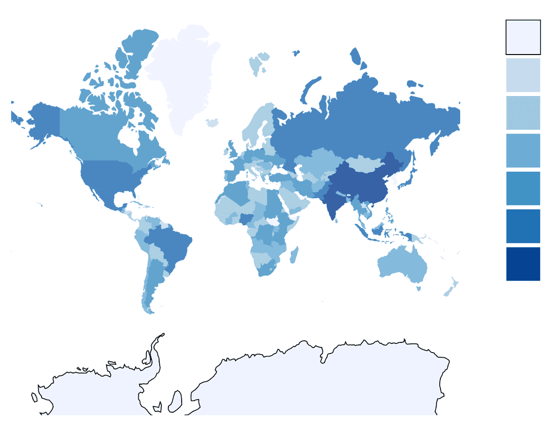
The main way to create colours in a sequential palette by varying lightness while keeping hue the same. Typically, lower lightness values are associated with lighter colours, and higher values with darker colours.
Diverging colour Schemes
Diverging colour schemes are best used to highlight both high and low extreme values, or values that differ significantly from the norm [2]. Also, this colour scheme is usually for used for data that include a critical midpoint value (mean, median, or zero value) and a data distribution that includes two ends of importance. Diverging schemes put equal emphasis on mid-range critical values and extremes at both ends of the data range [3].
The chart below visualizes the popularity of Liberal and Conservative Parties in the Canadian house of Commons in each province. A diverging colour scheme is appropriate for this kind of data popularity of two parties can have two opposite extremes with a neutral mid ground. In this case, that mid ground is represented by a light grey with a saturated red representing 100% Conservative and conversely for the Liberal party.
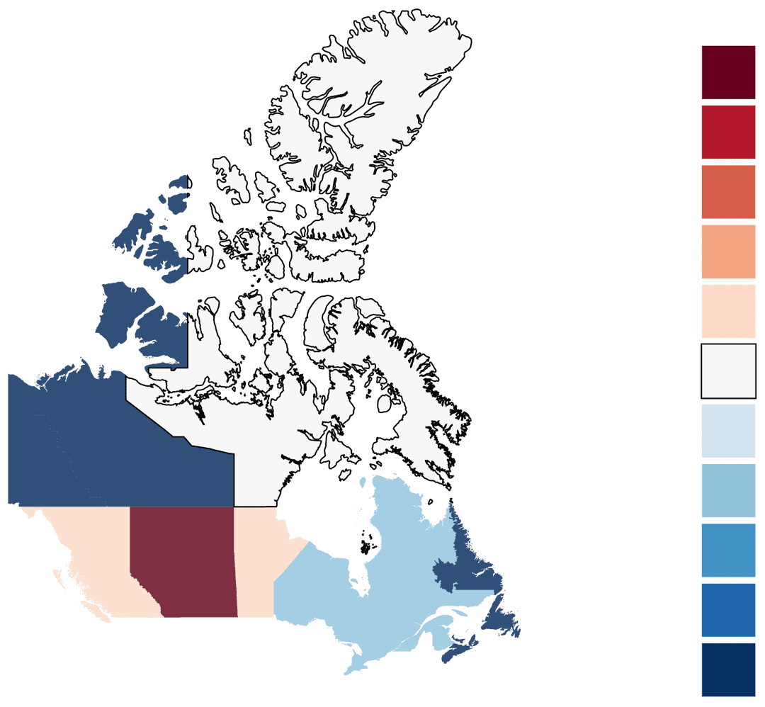
A diverging colour scheme can be thought of as two opposite facing sequential colour schemes whose tail ends have been joined together. The point at which they are joined from the middle of the diving colour scheme which should have a light and neutral colour so that darker colours indicate a further distance from the center. Typically, a distinctive hue is used for each of the component sequential palettes to make it easier to distinguish between positive and negative values relative to the center.
Qualitative colour Schemes
Qualitative schemes are best suited to represent nominal or categorical data, they have no inherent ordering.
It is best to not have more than 10 colours as it then becomes hard to distinguish between categories. If you have more than 10 categories, consider combining some into a single category like ‘other’ as shown below.
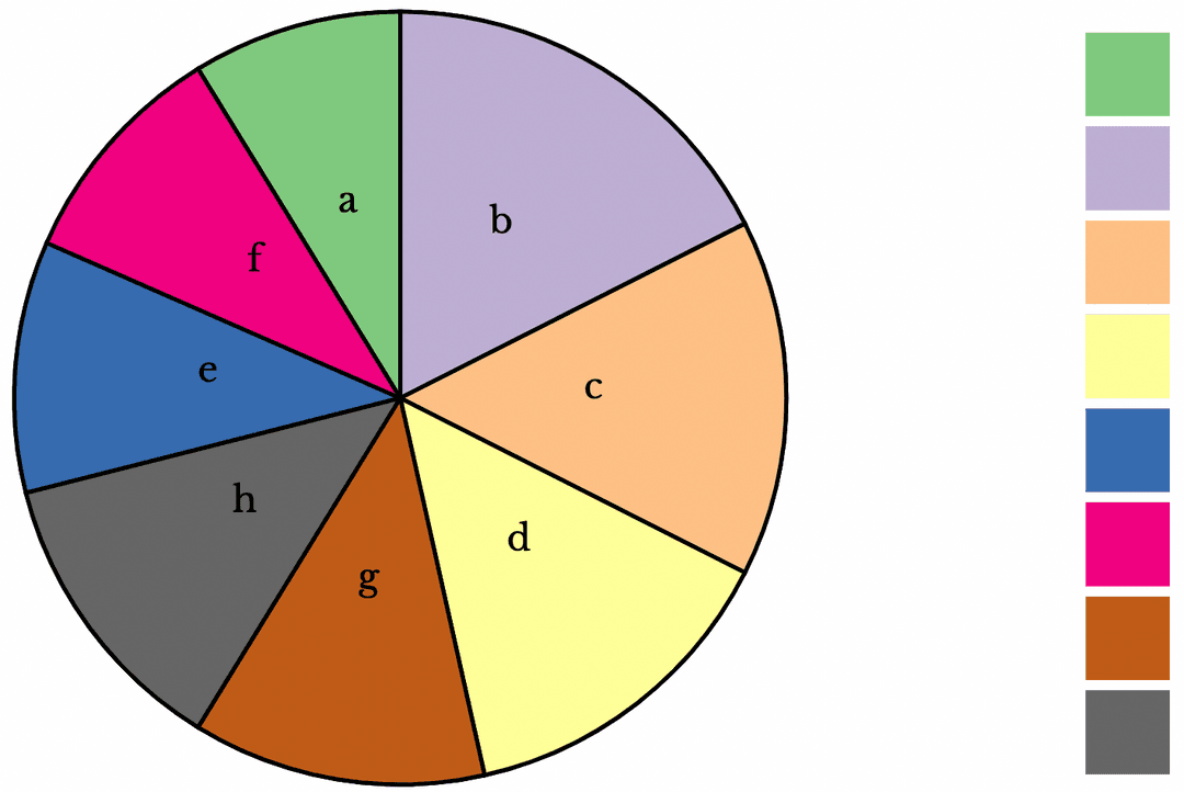
The main way to create distinct colours for a qualitative scheme would be by varying their hues. Additionally, lightness and saturation can be slightly tuned to further distinguish different colours but it’s a good idea not to make the differences too large. Too much difference might suggest that some colours are more important than others [4].
What makes a bad colour scheme
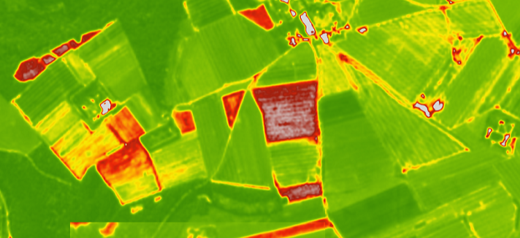
An appropriate colour pallet will correctly represent the shape of your data. Some colour schemes can un proportionately misrepresent data - and thus making it seem like there are large and significant differences in some of your data compared to the rest of it when in fact this is not really the case.
To explain the potential for serious consequences, The Wall Street Journal provided the recent example of the maps used during Hurricane Florence:
“For instance, the map consulted by Mr. Trump and his advisers during Hurricane Florence included a sharp boundary between yellow and green bands that appeared to represent a huge drop in the probability of tropical-force storm winds. This border stretched through Delaware, West Virginia, Virginia, North Carolina and South Carolina, affecting millions of people trying to determine the level of risk the storm posed. In fact, the difference was just 10%. Such visual confusion also can mislead policy makers tasked with issuing evacuation warnings.”

The issue is not that we are using a colour that is further away from the other colours in the pallet to intentionally skew the data being represented. If we looked at the colour scheme, every one of these colours is mathematically equidistant from each other. The issue is that there are significant differences in the perceptual distance between them.
As humans we do not perceive distances and differences in colour as they are represented mathematically. This means that we need to take into account how humans perceive colour as it is more important to consider the perceptual distances between colours than the mathematical distance between them.
How to choose a good colour scheme
A good colour scheme will proportionally represent the perceptual distances between colours and will use colours that are easy for us to differentiate. This way we can avoid situations like the hurricane Florence visualization above. This makes things a bit more difficult for us since it takes a lot of work to develop perceptually good colour
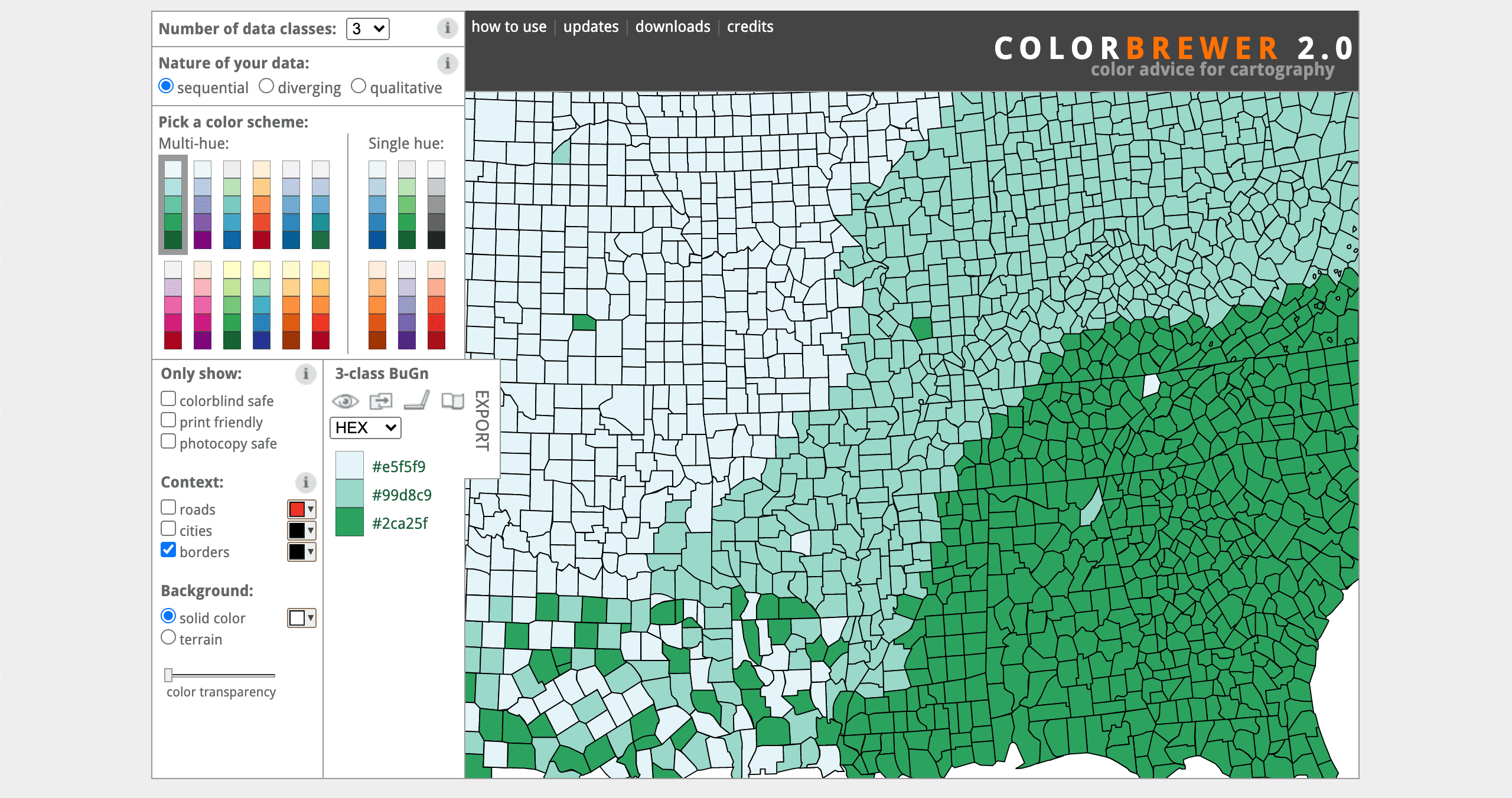
schemes but fortunately for us there are plenty resources available for us to choose good colour schemes. One of these resources is called Color Brewer, its a fantastic tool for choosing good colour schemes and was designed to take some of the guesswork out of this process by helping users select appropriate colour schemes for either sequential, diverging and qualitative types of data.
Perceptually equidistant colour schemes take a considerable amount of work to develop as they are the result of scientific research and experimentation so we don't recommend that you try make your own. In addition to Color Brewer, most data science and graphing libraries will have perceptually equidistant colour pallets for you to use without having to define them yourself.
Using good colour schemes in D3
One such library that has great support for good colour schemes is D3.js, which we have used to create all the visualizations above.
D3.js is a JavaScript library for manipulating documents based on data. D3 helps you bring data to life using HTML, SVG, and CSS.Creating a colour scheme will involve:
- Choosing a colour pallet
- Interpolating that colour pallet such that all the colours in that colour palette are mapped within the numbers 1 and 0
- Scaling your data using the appropriate scaling and the range of your data (which will be passed in as the domain of the scaling function)
- Passing the interpolator to the scaling function
This will produce a function that will input a single one of your data points and output a colour on your chosen colour pallet.
The following is a demonstration on creating various colour schemes, while they are in D3 the consepts should be the same for any data visualization library.
Interpolation
The d3-interpolate module offers a way of computing intermediate values between two given values.
d3.interpolate takes two values on a given domain [a, b] and creates a relevant interpolator based on the type of values on the domain. The values a and b need not be numbers and could instead be colours or other objects.
The interpolator function, which is returned by calling d3.interpolate on a given domain, expects an input value between 0 and 1 and returns an intermediate value between [a, b]
Here is an example for creating an interpolator between two numbers:
const interpolator = d3.interpolate(0, 100)console.log(interpolator(0.3)) // 30
Continuous colour palettes
Interpolators for sequential scales always have exactly two elements. We can create an interpolator for a simple sequential colour scale using an interpolator
const interpolator = d3.interpolate('blue', 'red')console.log(interpolator(0.5)) // "rgb(128, 0, 128)"
The above interpolator can be used to create a sequential colour ramp:
Continuous colour palettes, multi hue
Interpolators do not need to span between only two colours, for example, d3 provides us with **multi hue** sequential interpolators
const interpolator = d3.interpolateInferno
Scale sequential
The scaleSequential(interpolator) method maps a continuous domain to a continuous range defined by an interpolator function. You can define your own interpolator function or use a built-in d3 interpolator function.
A sequential scale is particularly useful for mapping a continuous interval of numeric values to a series of colours. We can use d3's scaleSequential function to map numbers between 23 and 598 to the inferno colour range
const interp = d3.interpolateInfernoconst sequentialScale = d3.scaleSequential(interp).domain([23, 598])console.log(sequentialScale(23)) // #000004console.log(sequentialScale(598)) // #fcffa4
As we can see from the output above, putting the extremes of our domain into the resultant sequential scale gives the first and last colour in the inferno colour ramp, as expected. Scaling a number within our domain will return an intermediate colour on the inferno colour ramp.
Put formally, the scale takes the input value v, normalizes it linearly to a value t with respect to its domain (the start of the domain is mapped to t=0, the end mapped to t=1), and applies the interpolator function.
Divergent colour interpolator
Diverging scales help to visualize data that go in two opposite directions, for example positive and negative or top and bottom.
Their domain includes exactly three values: two extremes, and a central point. The default domain for diverging scales is [0, 0.5, 1] — most applications will set it to [–1, 0, 1] or [minimum, neutral, maximum].
After normalizing the input value according to these reference points, diverging scales call an interpolator. As they cut the domain into two parts around the critical midpoint, they work quite well with diverging colour interpolators, which typically join two sequential scales around a critical midpoint [5].
const interp = d3.interpolateRdYlBuconst divergingScale = d3.scaleDiverging(interp).domain([-55, 0, 23])console.log(divergingScale(-55)) // rgb(165, 0, 38)console.log(divergingScale(0)) // rgb(250, 248, 193)console.log(divergingScale(23)) // rgb(49, 54, 149)}
Interpolate discrete
d3.interpolateDiscrete creates an interpolator from an array of n elements, by subdividing the [0, 1] domain in n sections of equal lengths, and returning the corresponding element of the array for any 0 ≤ t ≤ 1.
const interp = d3.interpolateDiscrete(['red', 'green', 'blue'])const descreteScale = d3.scaleSequential(interp).domain([-55, 23])console.log(descreteScale(-55)) // redconsole.log(descreteScale(-5)) // greenconsole.log(descreteScale(23)) // blue
Interpolate Piecewise
Interpolate Piecewise lets you build a continuous interpolator that interpolates between all the elements in the array.
const interp = d3.piecewise(d3.interpolateHsl, ['red','orange','yellow','lime','green'])const piecewiseScale = d3.scaleSequential(interp).domain([0, 100])
If you enjoyed this blog post, sign up to our mailing list to be notified about new posts in the future!