Using Data Visualization to Quickly Forecast Avalanches and Enhance Public Safety
June 22, 2020
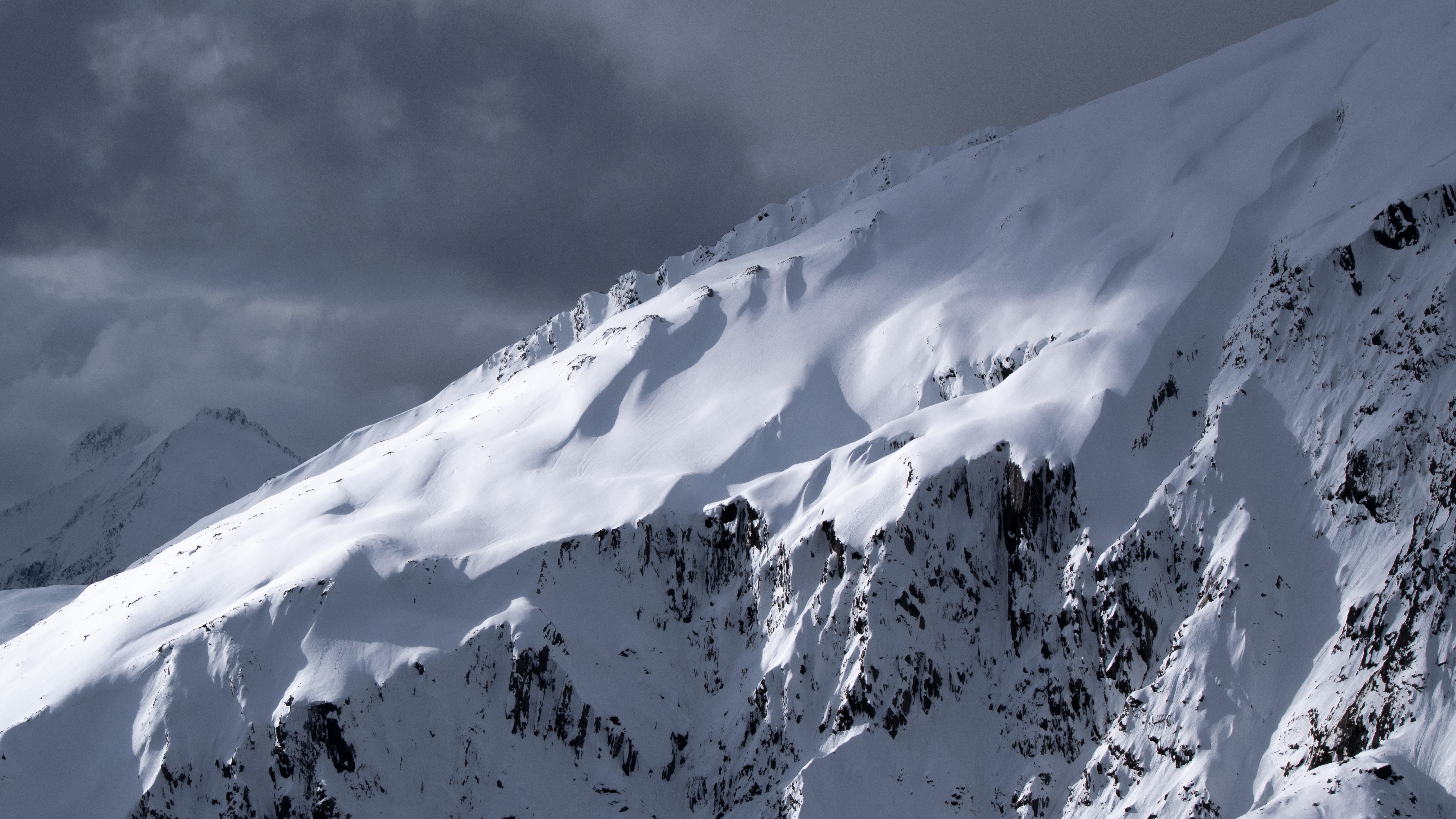
At the top of many mountains you'll find a weather station with an anemometer whirring away, measuring wind speed and direction, alongside a thermometer measuring temperature. There may be any number of other instruments passively tracking atmospheric pressure, humidity, or precipitation. But weather stations and their components aren't the only source of data to predict avalanche conditions. Sometimes, it's as simple as a ski guide licking a finger and sticking it up in the air.
Believe it or not, both of these types of information are critical to keeping people alive in the back country.
Avalanche Canada, a non-government, not-for-profit organization dedicated to public avalanche safety, needed a tool to bring these different data sets together to be displayed in a single place. Product development experts from Two Story Robot worked alongside Avalanche Canada's avalanche forecasters, their in-house technical team, and a data science researcher from Simon Fraser University, to build such a system.
The plan was ambitious, technically challenging, and potentially game changing.
Bringing data together from many sources
One of the biggest challenges was that the data avalanche forecasters need exists in a variety of places, in different formats, and with varying degrees of quality.
How do you merge wind sensor data with wet finger data?
Snow fall and temperature data are needed together, but many sources only have one or the other. Even if they do have both they are rarely displayed together. Managing all of these data nuances is almost impossible to do manually.
By leaning on GraphQL, a relatively newer API technology, we were able to make the data available in a single source rather than trying to piece all of it together. There's still a need to manage the differences in data, but it becomes fully isolated within the backend API so that the visualization system only needs to query a single, efficient resource.
The goal was to build a system where the only query needed was to search weather data by region. The GraphQL API will figure out the best source of data for that time frame and where to get it.
This leaves a forecaster free to focus on the assessment and the forecast rather than how and where to get the data they need.

Reactive Charts
With a consistent and unified view of the data, we can build interactive charts showing different aspects of the data. Avalanche forecasters need to be able to inspect multiple aspects of data. It's not enough to look at a single data point. Forecasters need to be able to look for and see trends in the aggregated data. The ability to see a pattern in one dimension of data and focus on those data points is a key feature of an interactive dashboard.
To accomplish this, nearly every chart on the visualization dashboard is reactive, filtering data from the interactions made on other charts.
How? Let us take a walk through each chart.
NOTE: The charts below are interactive, but only work on a desktop for now.
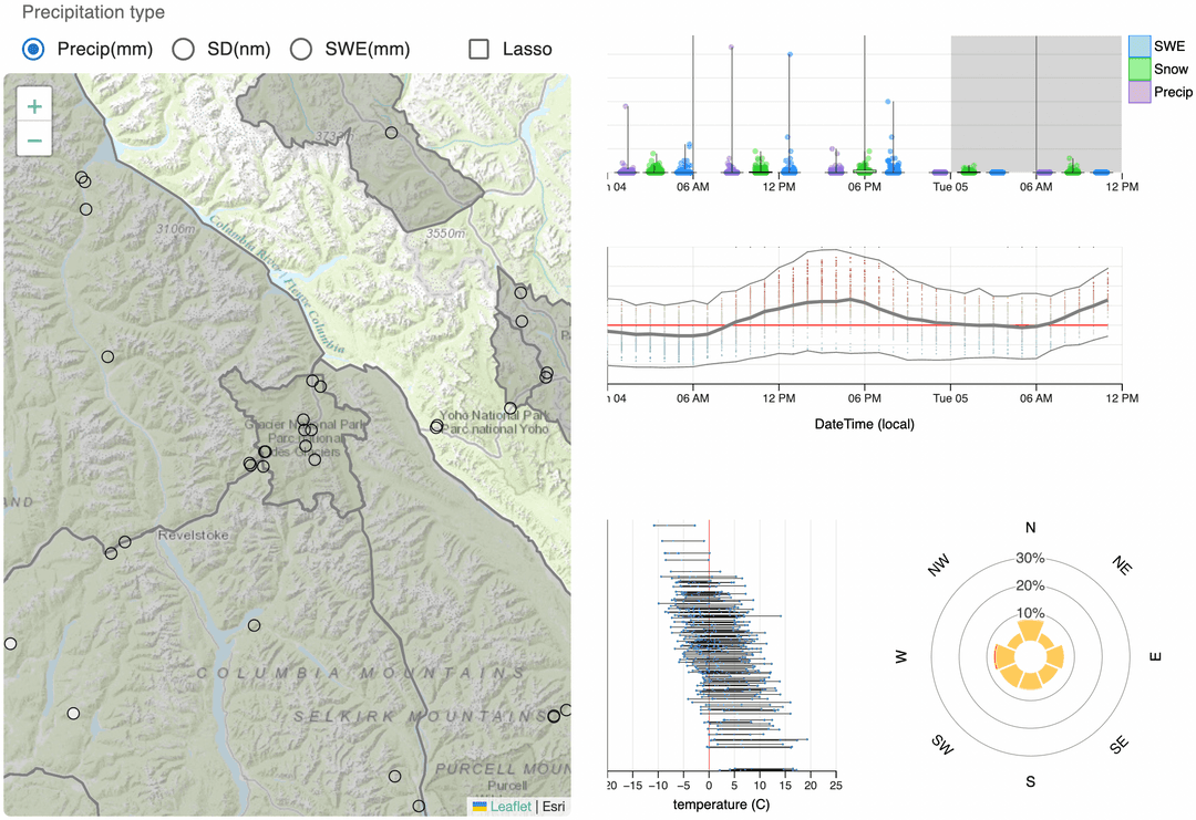
Weather stations are geographic
Displaying data on a map is a common visualization task and avalanche weather data is no different. For avalanche forecasters though, this data has never been available in an interactive and integrated map form. As we mentioned above, weather data lives in different places. Traditionally, forecasters would need to bounce back and forth between systems in order to get a complete picture of the weather. Our map displays all available weather data regardless of the system it came from.
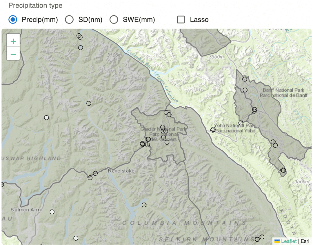
Try inspecting a few of the data points by hovering your mouse over the circles on the maps. This will reveal all available data for a particular location including precipitation, wind, and temperature. The ability for avalanche forecasters to so easily view this data interactively is a significant improvement over how it's been done in the past. Normally, forecasters combine data themselves in written form or a spreadsheet—assuming they knew where to look for the best source of point-in-time data.
In the production version of this software, forecasters are presented with a set of regions to select from as they rarely need to see data for the entire province at once. For the purposes of this example, we are using a smaller subset of the data that a forecaster would have available to them.
Try clicking the lasso checkbox and click to draw a circle around some points on the map. This innovative tool allows a forecaster to precisely select the data they are interested in working with—something they've never been able to do before.
Weather is elevation dependent
Sometimes it's snowy and cloudy at your house but sunny and clear up at the local ski hill. Selecting weather data purely by geographic location is not always enough. Avalanche forecasters are often interested what the weather is like at specific elevations. The temperature range and elevation chart plots these points, providing a unique way to access data for avalanche forecasting.
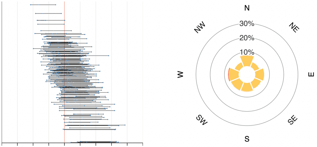
Intuitively, you might notice that the temperature tends to drop at higher elevations. This is an important visual cue for forecasters who are interested in knowing the elevation of the freezing point, and the time frame of the temperature drop. Forecasters can easily spot this point, but what is difficult to see is what the wind is doing at certain elevations. The forecaster may need to know if the wind has been blowing snow towards or away from a particular slope or aspect.
Try clicking and dragging to create a box over approximately 1800 meters and 2000 meters. Notice that the wind rose chart changes to show only the wind at that selected elevation band. Now try dragging and resizing the box to see its effects on the wind rose.
Forecasters can use this tool to get a sense of what is happening at a specific elevation band. What might look like inconsistent wind in a broad view can be revealed to be consistent directional wind at a narrow view. This might mean the difference between high and low risk of avalanche.
Avalanche forecasting is time dependent
If you look outside right now, chances are the weather looks different than it did yesterday or even a few hours ago. When forecasting avalanches, it's important to know what combination of factors occured. For example, a heavy snowfall was followed by a period of warmer temperature. The precipitation and temperature timelines help narrow down this information. The charts display different types of precipitation and snowfall accumulation, in six-hour segments, as well as aggregate temperature data over time.
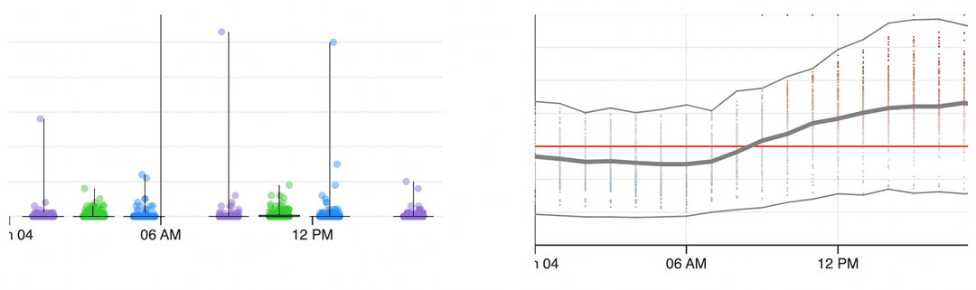
The chart on top plots various precipitation meaures over time. The chart below it plots the temperature along that same time. Try hovering your mouse over one of the dots in the precipitation timeline. The temperature chart will highlight all sampled temperatures for that point. Now try creating a box in the precipitation chart (just like you did in the temperature range and elevation chart). The temperature chart adjusts to show the aggregate temperatures for the timeline selected.
By interacting with this time series data, forecasters can visually spot important data points and quickly analyze related data. Previous to this dashboard, forecasters would need to look up data in tables and mentally model their forecasts.
Saving time, saving lives, and experiencing joy
When all views are combined, they form a powerful tool that provides access to a vast amount of data which was previously inaccessible in an aggregate form. Data can be explored through a number of different axes and segmented to form the precise window the forecaster needs to do their job well. Information is presented in a ready-to-be-consumed way with no interpretation required.
Sometimes the signs of an avalanche are easy to see and it is relatively straightforward to determine the risk. More often though, conditions are less obvious and forecasters have to dig around for hours looking at various tables of data.
Relying on mental models can also result in inconsistencies from bias between individual forecasters. One forecaster may come to a different conclusion than another based on the same raw data.
Increasing accuracy and timeliness of information results in enhanced public safety and a greater potential to save lives.
Ultimately, when the tools you use allow you to focus on those important aspects of your job... the fun parts of your job, without wasting time and reducing mistakes, you get to experience a little more joy.
At Two Story Robot we are passionate about creating value through excellence in technology and solving complex but exciting problems. We're thrilled to have been able to come into this domain knowing very little about avalanche forecasting (despite having some staff members with avalanche training) and deliver a high-quality product.
We are interested in working with other teams to help them achieve new insights from their data and find new ways of working that enhance joy.
This post is part of a series of posts on data science and data visualization. Some more technical, some more every day. If this sort of thing interests you, we encourage you to subscribe to our newsletter to know when new content is published.
Thanks to Stan Nowak, Ben Shaw, Karl Klassen, and the Avalanche Canada team for their input.
Related: How a small team like Two Story Robot can adapt to complex needs of systems at Avalanche Canada